The MCU is a masterpiece of Hollywood brand recognition, creating a shared universe that revolutionized the blockbuster landscape. But there are some downsides to the Marvel formula. To bring all the strands of the franchise together, Marvel had to make the films look similar. And creatively speaking, that shared aesthetic isn't always a good idea.
Obviously, there are a few visually exciting exceptions like Black Panther and Thor: Ragnarok, but for the most part, the MCU likes to follow a grey-toned color palette with deceptively subdued costume choices. The superheroes generally look less interesting than their colorful counterparts in the comics, and in this week's Behind the Seams video, we explain why that's led to some creative problems down the line.
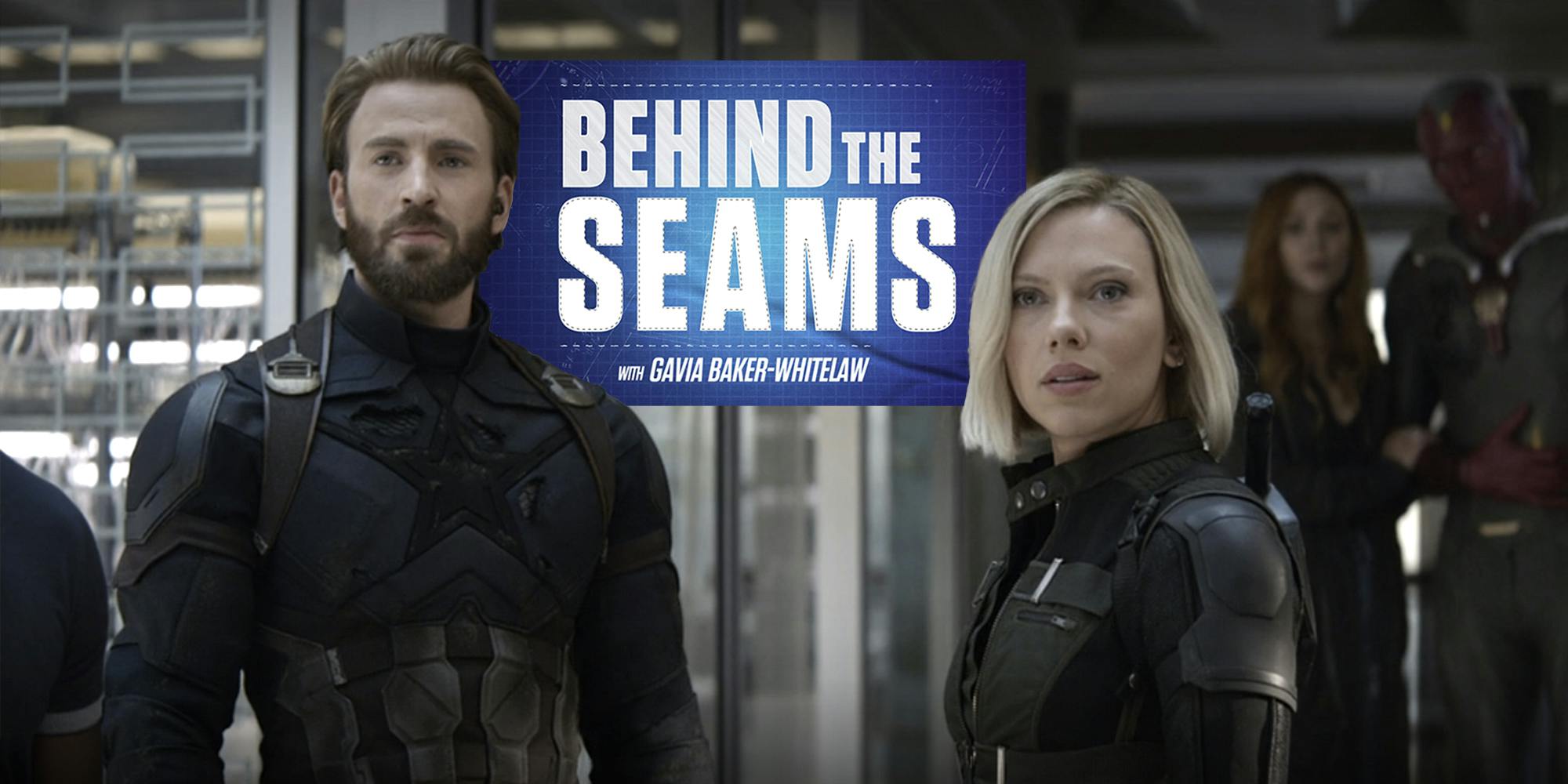
Each week on Behind the Seams, we examine a different element of cinematic costume design, whether it’s an in-depth analysis of Mad Max: Fury Road, or a look at the concept of historical accuracy. Click here to subscribe now!
The post Why the MCU’s superhero costumes should look more like the comics appeared first on The Daily Dot.


0 Commentaires